

The tube map looks pretty different from a plane flying above the Thames.
We do pretty well for ‘alternative’ tube maps; from this really honest tube map, to the one that shows you cheap pints, to the one that shows just how unaffordable London really is. This one, however, serves no real purpose besides looking pretty awesome.
Back in 2018, Redditor artinmartin edited an aerial shot taken by Santero – drawing the London tube map onto the image, as seen from a plane.
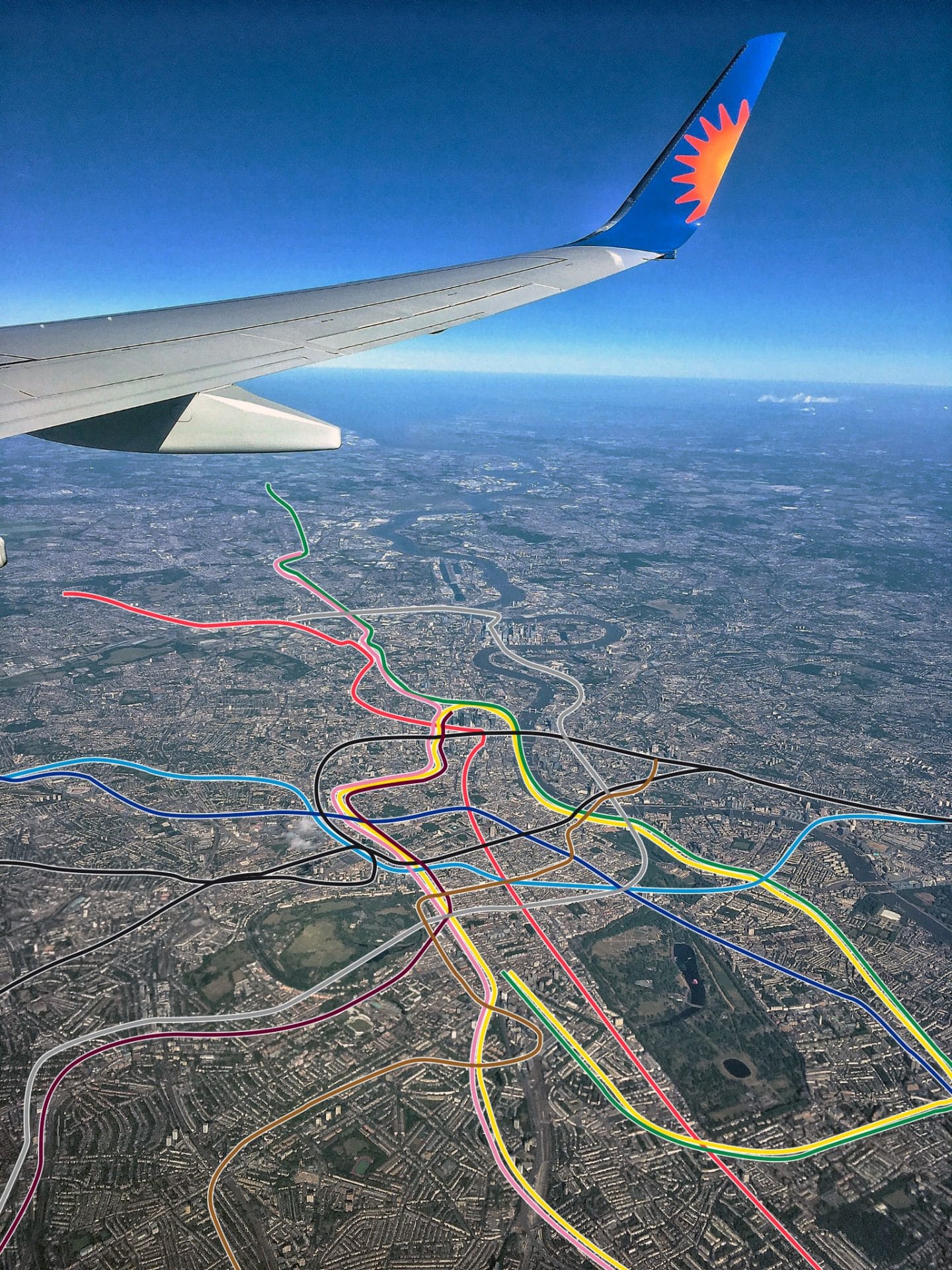
The image sparked some particularly fiery discussions about the Northern line, more specifically how the two branches should really have “two different names and colours”. One Redditor, teepenny, even responded by recreating the original tube map, separating the Northern line into two different lines, making one of them a (horrible) lime green.

Seeing it from this perspective, you really notice how scanty the underground network gets as you move south of the river. One Redditor commented, “South East London is very… bare.” LOL.
In other—more depressing—tube map news, this one will show you what you need to earn to buy a house in London.
Also published on Medium.